How to write clear and strong calls to action that boost sales
Capturing a visitor’s attention and guiding them toward a goal is the core purpose of a call to action (CTA). When done correctly, a can turn casual browsers into loyal customers. But crafting effective CTAs isn’t just about slapping on a button or a link; it’s about making them clear, persuasive, and impossible to ignore.

Research shows that well-designed websites can increase conversion rates by as much as 80%. That means a small tweak here or there could significantly boost your sales and marketing ROI. Whether you run an online store, a service business, or a newsletter, understanding how to craft powerful calls to action can make a real difference.
The Fundamentals of Effective Calls to Action
Understanding the Purpose of a CTA
A CTA is a prompt that tells your audience what step to take next. It’s the final nudge in your sales funnel. The main job? Guide users to act—whether that’s buying, signing up, or learning more. Without a clear CTA, potential customers might get lost or lose interest. It acts as the bridge between interest and action.
Common Types of CTAs
Different goals call for different Here are some typical examples:
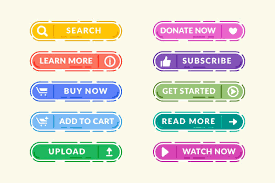
- “Buy Now”—perfect for e-commerce sites aiming for direct sales.
- “””Subscribe”—Great“—Great for building your email list.
- “Download—Use—Used”—Used offering free resources like e-books or guides.
- “Get a Quote”—Ideal “for service-based businesses needing customer info.
Use these based on your goal. Want quick sales? Use “Buy Now.” Looking to build your email list? “Subscribe” works best.

Essential Elements of a Strong CTA
A good CTA hits a few key points:
- Clarity & Specificity—The message must be clear so users understand what to do.
- Urgency & Scarcity—Temp users with phrases like “Limited time” or “While stocks last.”
- Design & Placement—Make your CTA stand out visually and put it where users will see it right away.
Crafting Clear and Persuasive CTA Copy
Using Action-Oriented Language
Power verbs grab attention and drive action. Think along the lines of “Discover,” “Join,” “Save,” or “Create.” Pair these with emotional triggers—like feeling exclusive or saving money—to make your message resonate.
Keeping It Concise and Focused
Less is more. Aim for 3–7 words that get straight to the point. For example, instead of “Click here to learn more about our exciting offer,” use “Get Your Discount.” Avoid vague or passive words that don’t inspire action.

Personalization and Relevance
Speak directly to your audience. Tailor your message based on who they are or what they’ve shown interest in. Tools that use dynamic content help deliver personalized messages, like “Hey Sarah, claim your free trial now.” This increases the chance users will click.
Designing Visually Appealing and Effective CTAs
Placement and Visibility
Position your CTA where users expect to see it—above the fold or at the end of a product description. On long pages, repeat your CTA in different spots to catch users at multiple moments. Remember, a visible can make or break conversions.
Use of Color and Contrast
Choose colors that stand out from your background while matching your brand. Bright shades like red, orange, or green often perform well. A high-contrast button draws the eye and encourages clicks.

Incorporating Design Elements
Add arrows or icons to direct attention. Use whitespace to make your CTA pop without clutter. Keep your design consistent across your website, emails, and ads to build familiarity.
Testing and Optimizing Your Calls to Action
A/B Testing Strategies
Test different versions to see what works. For example, try changing the copy, color, or placement. Small changes can lead to big jumps in conversion. One case study showed a 30% increase in sign-ups just by switching the CTA color.
Using Analytics to Drive Improvements
Track how users interact with your CTAs. Metrics like click-through rate, conversion rate, and bounce rate tell you which versions perform best. Use tools like Google Analytics or heatmaps to gather insights.

Iterative Refinement
Regularly update your CTAs based on data and feedback. If a particular phrase isn’t working, test a new one. Continuously refine until you find what resonates most with your audience.
Real-World Examples and Case Studies
Amazon’s “Buy Now” button is a classic example. It’s straightforward, highly visible, and screams urgency. Dropbox offers a clear “Get Started for Free, removing any hesitation about trying their service. These companies show the power of simple, well-designed CTAs.
Even less effective often make mistakes. A common pitfall? Using generic phrases like “Submit” or “Click Here,” which lack context or appeal. Clear, benefit-driven language paired with design makes all the difference.
Conclusion
Creating effective calls to action is both an art and a science. Focus on clarity, use compelling language, design for visibility, and test consistently. Remember, your goal is to guide users smoothly toward the next step, matching what they want with what you offer. Keep refining your base on real data, and you’ll see sales and engagement grow over time.
The best CTA in the world won’t work if it’s not aligned with your customer’s journey. Make sure every call to action speaks directly to their needs and desires, and watch your sales reach new heights. Your next great conversion is just a well-crafted away.


